How Product Page Layout Around a Laptop Mockup Affects Scroll Depth and Time on Page
There’s a quiet battle happening on every product page. Not between competitors, not between price points — but between your visitor’s attention span and the gravitational pull of the back button. The layout you choose around your hero visuals isn’t decoration. It’s architecture. And when that hero visual is a laptop mockup, the stakes get even more interesting.
Let’s talk about what’s really going on beneath the surface of scroll depth analytics — and why the arrangement of elements around your mockup might matter just as much as the mockup itself.
The Scroll Depth Problem Nobody Talks About
Most designers obsess over the mockup. Sharp shadows, realistic reflections, pixel-perfect screen content. Fair enough. But then they drop it into a page layout like furniture into an empty room — centered, padded, symmetrical — and wonder why users bounce after three seconds.
Scroll depth isn’t just about content length. It’s about visual momentum. When a visitor lands on your page, their eye doesn’t read — it travels. The mockup is a landmark. What surrounds it either creates a path forward or a dead end.
A centered laptop floating in white space with a headline above and a CTA button below is clean. It’s also static. There’s no reason to scroll because the composition feels complete. Finished. Done. The user got what they came for (a glimpse) and left.
Layout Patterns That Actually Extend Engagement
Here’s where it gets tactically interesting. Designers who study heat maps and session recordings consistently find that certain layout choices around device mockups push scroll depth significantly higher:
- Diagonal or offset placement — When the mockup is tilted or positioned slightly off-center, the eye naturally wants to “correct” it by moving down the page, creating involuntary scroll behavior.
- Split-screen storytelling — Pairing the mockup with copy on the left or right (rather than above/below) creates parallel reading lanes. Users stay longer because they’re processing two streams of information simultaneously.
- Progressive reveal layouts — Showing only part of a second mockup below the fold explicitly signals: there’s more. Curiosity does the rest.
The difference in time-on-page between a static centered layout and an offset diagonal one can be dramatic — sometimes 40–60 seconds longer per session, depending on the product category.
Real-World Examples: Laptop Mockups in Practice
Theory is one thing. But the impact becomes obvious when you look at how actual teams use laptop mockups across industries.
SaaS landing pages are perhaps the most natural home for laptop mockups. Companies like project management tools and analytics dashboards use them to show their UI in context — not as a flat screenshot but as a lived experience. When the mockup is angled at 15 degrees with ambient light catching the keyboard, visitors immediately visualize themselves using the product.
Freelance portfolio sites use laptop mockups to reframe web projects as premium deliverables. A website screenshot is forgettable. That same screenshot inside a sleek silver laptop, placed against a warm neutral background with soft bokeh? It becomes a case study.
Digital product sellers — selling Notion templates, Figma systems, WordPress themes — use mockups on Gumroad and Etsy storefronts to compete visually in dense marketplaces. The mockup is doing sales psychology work: it makes an intangible file feel ownable.
Agency pitch decks embedded in web pages use laptop mockups as scroll anchors — each section reveals a new project inside the same device frame, creating a cohesive narrative thread through the page.
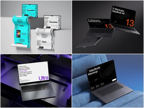
Laptop Mockups on ls.graphics: A Benchmark Worth Knowing
If you’re sourcing mockups and care about how they perform inside a real layout, ls.graphics has built a library that’s genuinely hard to overlook. Their laptop mockup collection delivers ultra-realistic rendering with natural light physics, fully organized layers for fast screen swaps, and multiple angles per scene. Color style variations, stylish minimalistic compositions, and an Edit Online feature make customization effortless — no Photoshop needed. Plenty of free scenes are available to explore before committing.
Conclusion: Layout Is the Message
A laptop mockup is never just an image. It’s a trust signal, a context setter, and — when placed correctly — a scroll trigger. The brands winning on engagement metrics aren’t necessarily using better products. They’re using better spatial logic around their visuals.
Get the layout right, and your mockup earns its place. Get it wrong, and even the most beautiful render becomes wallpaper.
Start with quality assets from ls.graphics, then treat the surrounding layout with the same creative seriousness you’d give the visual itself. Your session duration numbers will notice.